Paybis – Illustration Styleguide And Promo
Industry
Fintech
Company
Paybis
Role
Art direction | Illustration
Date
2024
Paybis.com is a UK-based cryptocurrency exchange founded in 2014. The exchange provides cryptocurrency for fiat currency trading and is considered one of the most well-known cryptocurrency exchanges in the Baltics.
Description
Development of a scalable illustration system for explainer videos and promo materials, expanding the brand's visual language while maintaining consistency with existing Paybis identity. Focused on clarity, flexibility, and narrative impact across digital touchpoints.
Goals
Animation-friendly illustration style supported by a detailed and accessible style guide, specifically tailored for animators with a junior-level background in illustration (client's request). The system was designed to be scalable and flexible, ensuring it could be effectively applied across a variety of promotional and marketing materials while maintaining visual consistency.
Colors
The original Paybis brand guide featured only blue, black, and white. I expanded the palette with additional accent colors and introduced a dot pattern to enhance visual flexibility and better illustrate platform-related topics.

Rules
The illustration style embraces minimalistic flat compositions with thoughtful use of negative space to create clarity and focus.
Shapes & Flow
Circular elements can be used to:
Draw attention to the main subject
Support smooth visual transitions between screens or sections
Echo the geometry of the Paybis logo, reinforcing brand consistency
Stroke Usage for Depth
Combine black strokes inside objects with white outer strokes to create a sense of layered depth and spaciousness
Maintain the standard stroke weight of 2 pt, with rounded ends for visual harmony
Enhancing the Visual Story
Use additional graphic elements sparingly to enrich the composition without overwhelming the focus
Aim for visual balance between decorative detail and functional clarity

Environment
A restrained and minimal approach defines the depiction of environments. Rather than detailing every element, abstract forms are used to subtly suggest space and setting. Cropping plays a key role in shaping compelling compositions, guiding focus and enhancing visual interest. Detail is applied thoughtfully, calibrated to the scale of objects to maintain clarity and balance. The overall effect is one of richness and intention—never excess.

Color Usage And Composition
Varied color combinations to support the narrative and evoke the appropriate mood for each scene.
Additional graphic elements to emphasize motion and enhance the overall sense of dynamics in the composition.


Characters
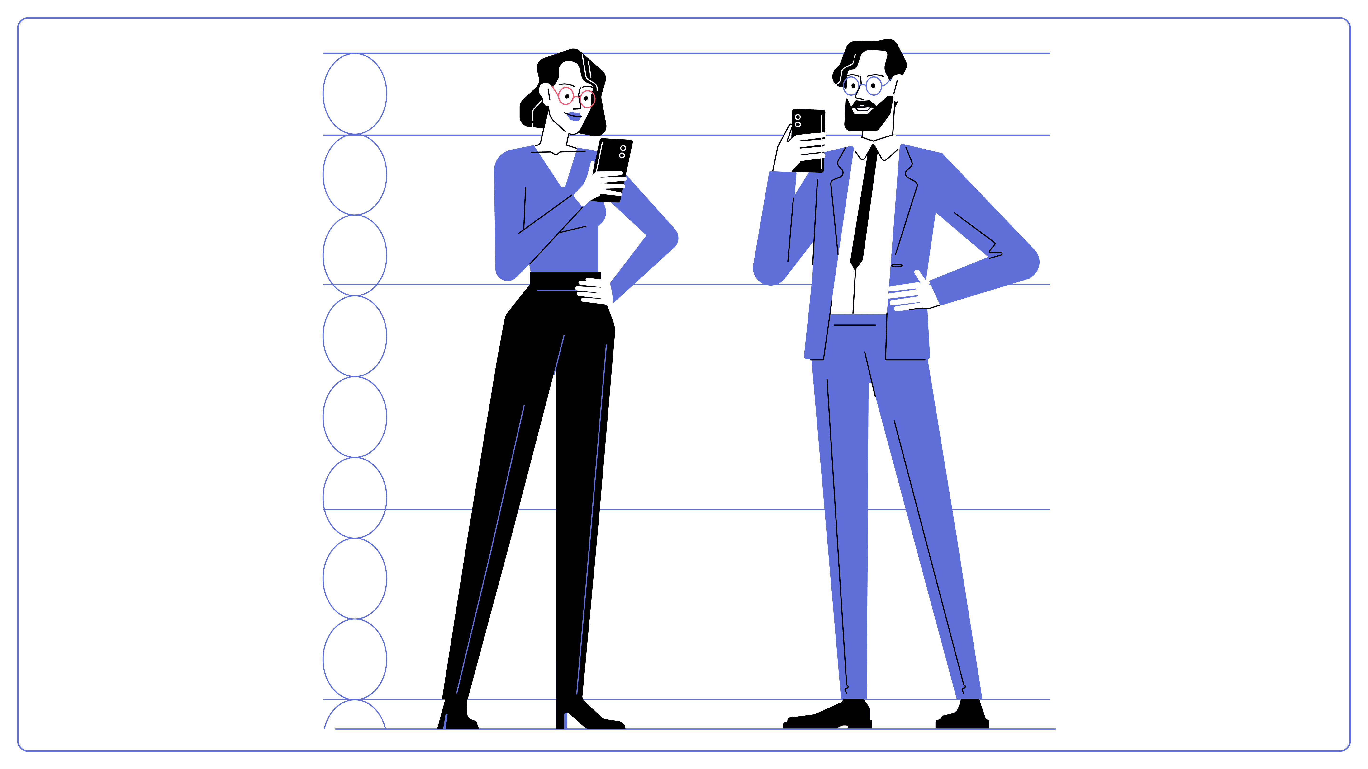
Characters are portrayed with a stylized yet recognizable aesthetic, retaining essential facial features to convey personality and expression. Proportions are subtly elongated, lending a refined but casual presence. The overall look is smart and approachable, with a clean and visually clear level of detail that supports both clarity and charm.
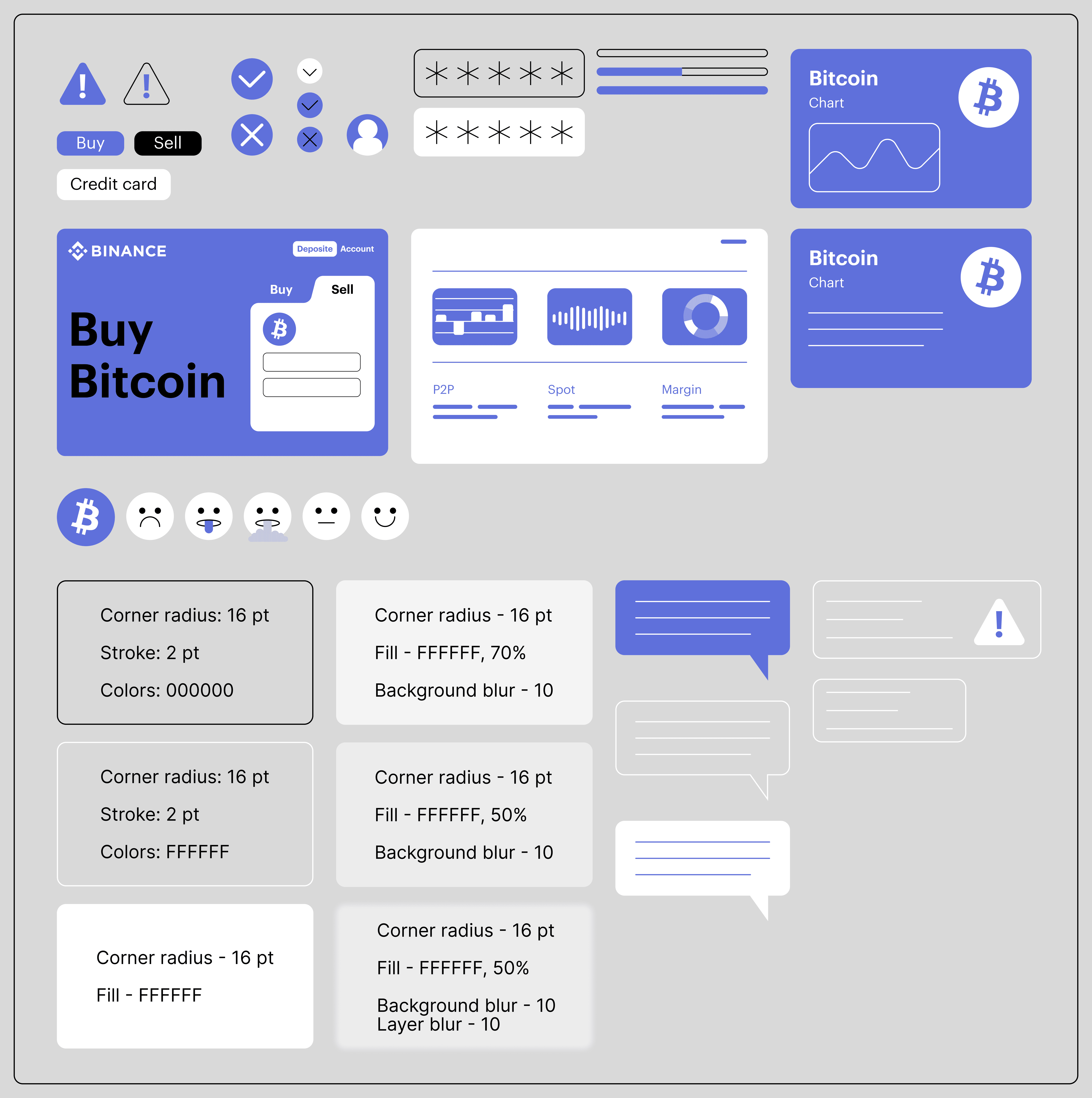
Stylized Ui Elements | Badges
UI elements are represented in a stylized and simplified manner, combining stroked, filled, or hybrid treatments to achieve visual clarity. A consistent corner radius of 16 pt is applied across all components to maintain cohesion.
Core UI components—such as buttons and password badges—are built as Figma components, enabling easy insertion of custom text while preserving visual consistency.
Dialogue bubbles use an abstracted form of text, represented as simple lines rather than full text rows, reinforcing the stylized aesthetic.
All badges are also structured as Figma components, allowing for flexible customization—whether filled with text or layered with other elements—without compromising visual integrity.
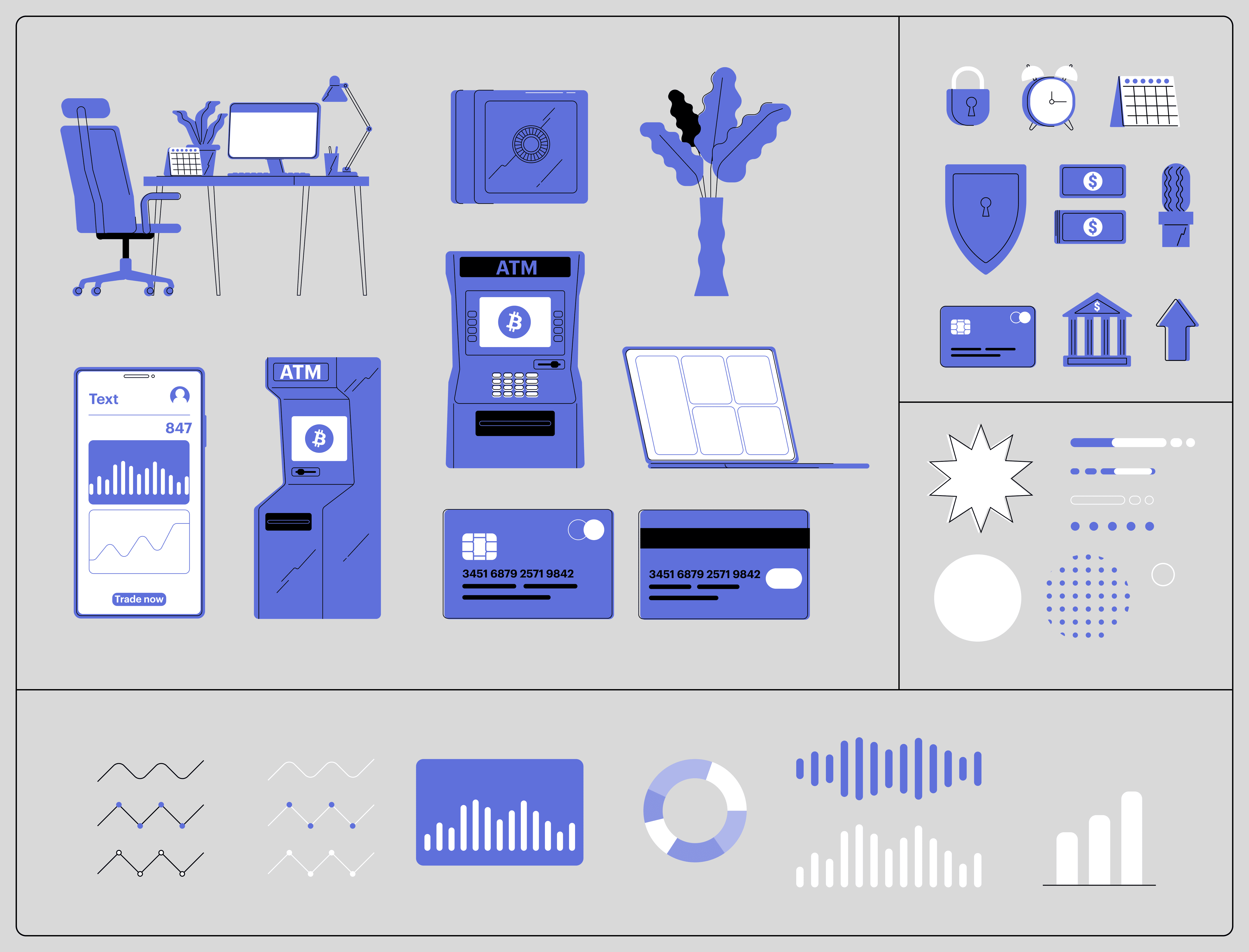
Objects | Additionsl elements
Objects are presented through flattened, simplified forms, with a sense of subtle volume suggested by elements extending from the left or right. They are shown strictly in front or side views, reinforcing clarity and stylistic uniformity.
Constructed from solid color shapes, objects typically use 1–2 base colors, with details added through strokes rather than complex shading. Strokes are placed primarily inside the object, avoiding outer outlines unless functionally or visually necessary.
Stroke color is determined by fill:
Blue fills use black strokes
White or black fills use blue strokes
To introduce visual energy and movement, strokes may be slightly displaced. Additionally, a zig-zag stroke pattern can be used internally to enhance style consistency and add a layer of visual interest.
Email Campaign Cards
This set of illustrations was created specifically for use in email campaigns, designed to ensure visual clarity, contrast, and consistency across a variety of email clients and screen settings—whether viewed in light or dark mode—without compromising on style.
Each card adheres to the established illustration system, featuring solid fills, stroke-based detailing, and limited accent colors. The compositions strike a balance between narrative expression and minimalism, making them both adaptable and visually engaging. Symbolic elements are thoughtfully integrated to support promotional or seasonal messaging, enhancing the impact of campaign content.

Affiliate and Referral Banners
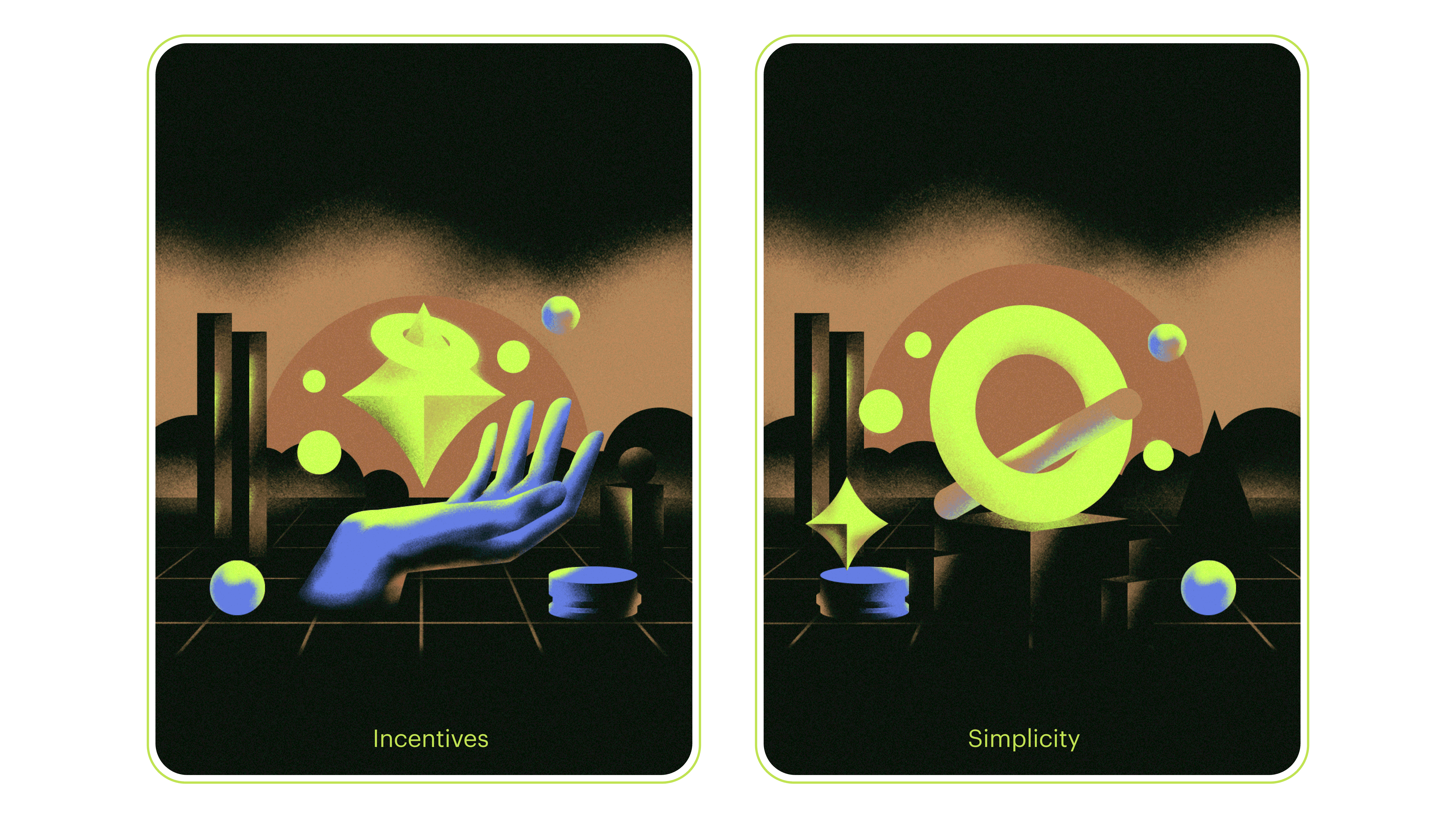
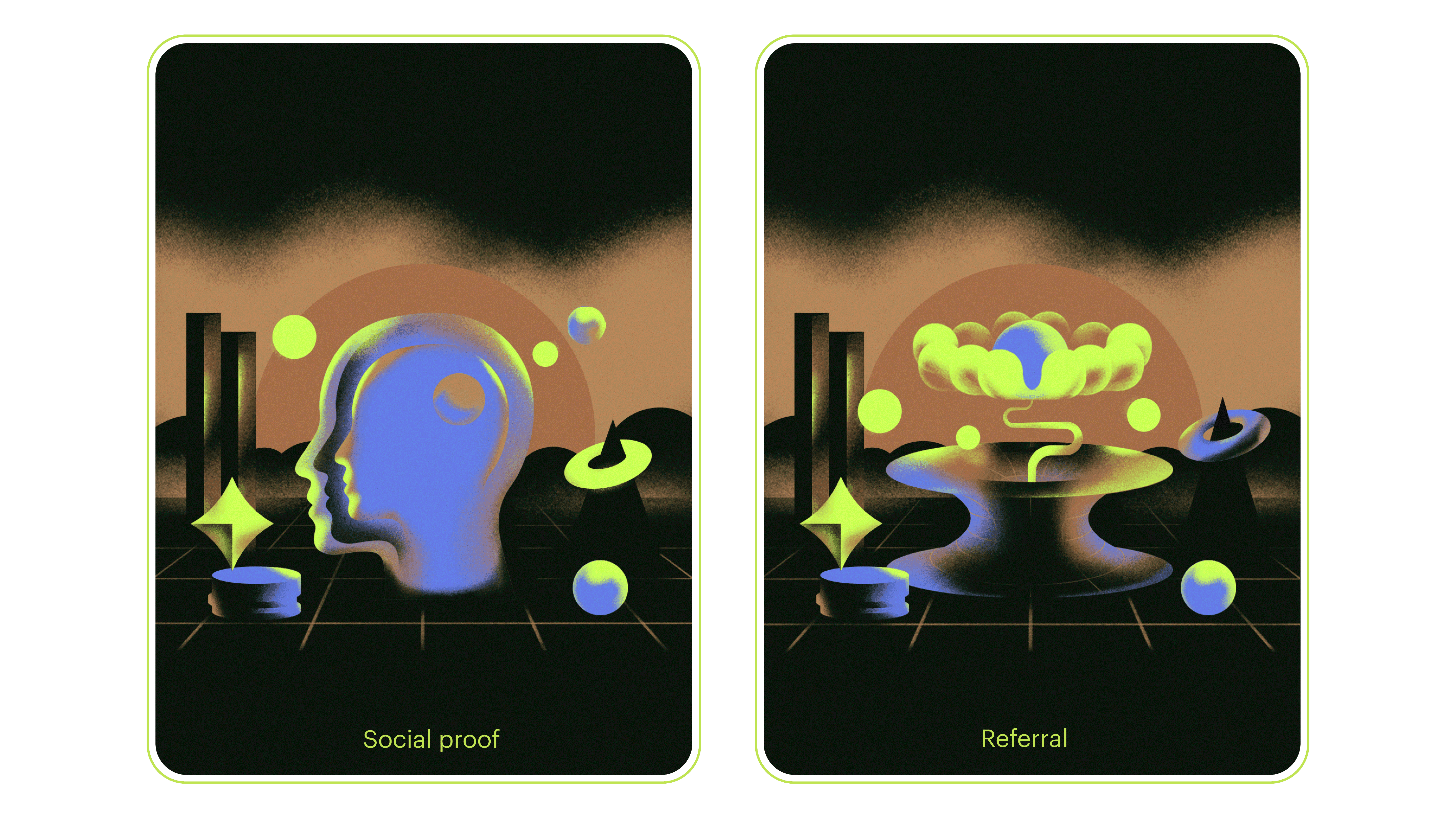
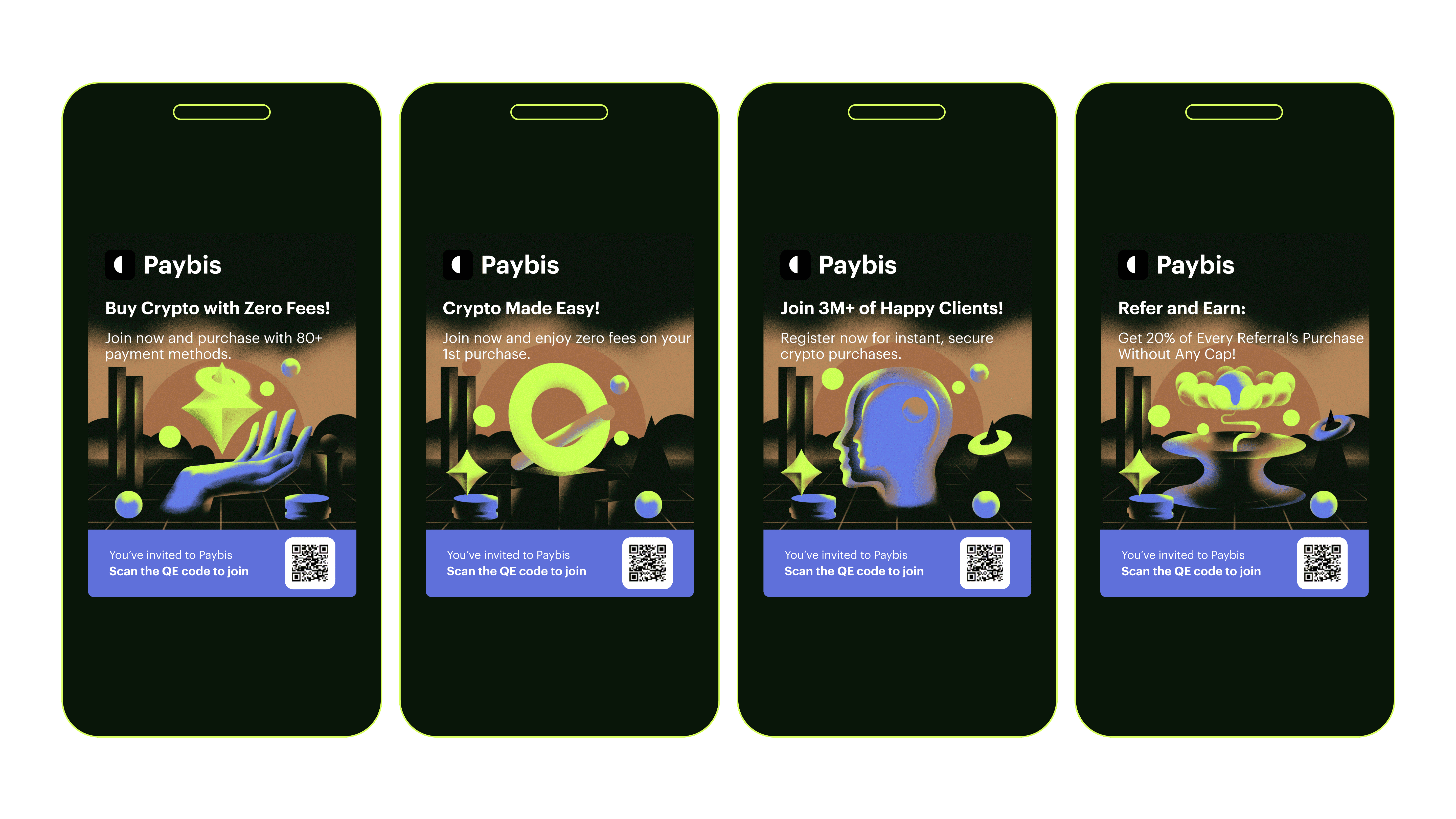
I developed a series of experimental promotional posters for the Paybis app, aimed at encouraging users to share and invite new members to the platform.
The creative brief provided four key themes to communicate: Incentives, Simplicity, Social Proof, and Referral. My task was to visually interpret each metaphor in a way that was both bold and intuitive.
To achieve this, I crafted a set of retro-futuristic compositions, combining vibrant accent colors, stylized forms, and airbrush-inspired effects. The result was a visually rich and immersive aesthetic designed to capture attention and stand out within the crypto and fintech space.
This approach allowed each poster to function not only as a promotional asset but also as a shareable, conversation-starting piece of visual content.