Flo App – Brand Design
Industry
Femtech
Company
Flo
Role
Art direction | Design
Date
May 2023
The world's most popular female health app Cycle & health predictions. It has over 380 million downloads worldwide and over 70 million monthly active users as of November 2024.
In this case study, I highlight my most impactful and influential contributions in the role of Lead Visual Designer.
Description
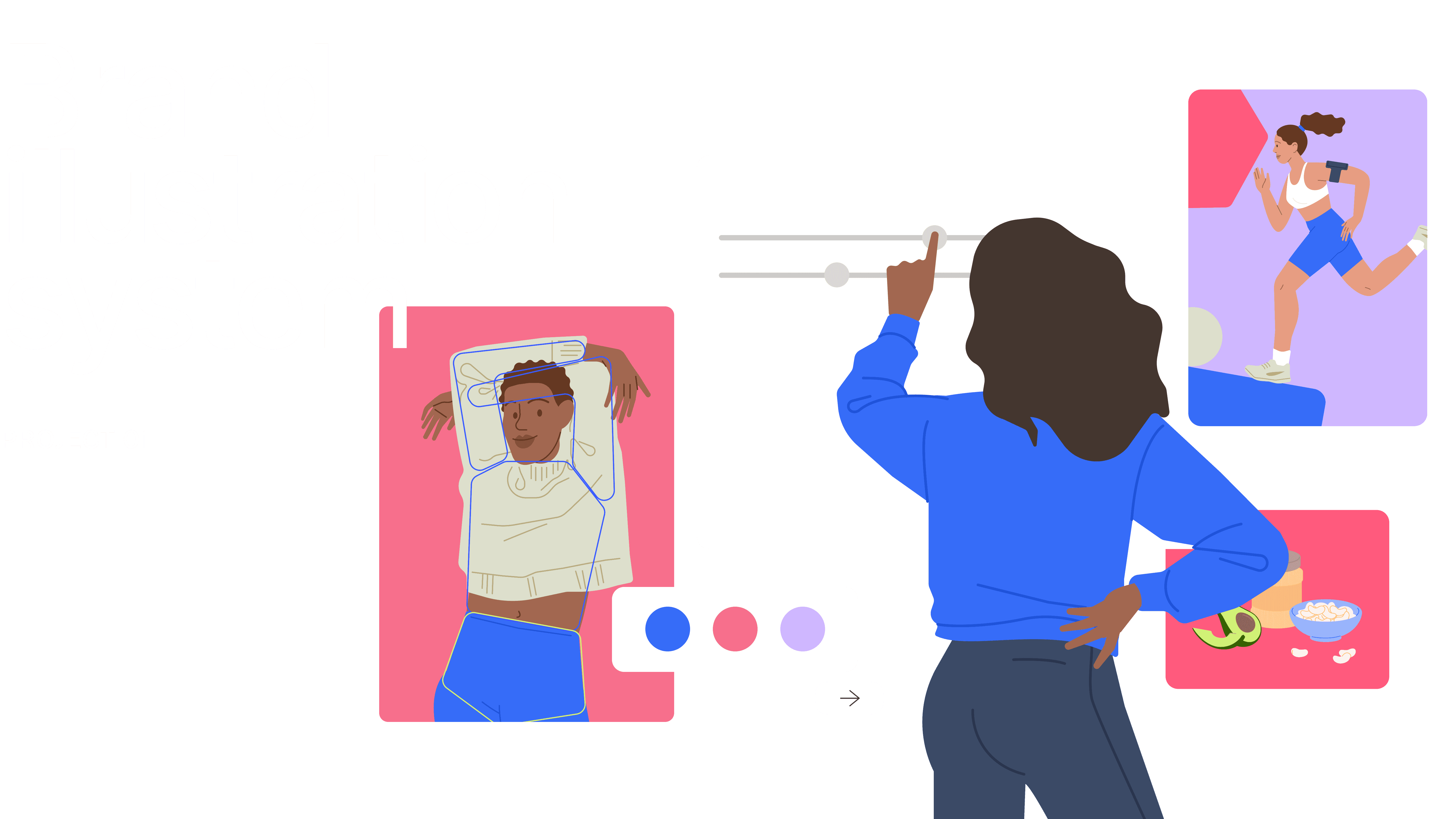
The illustration style is a core pillar of Flo’s brand identity and a key driver of visual consistency across the app. It’s the first visual touchpoint users encounter during onboarding and continues to guide and support them throughout their journey with the product. I led the creation of the entire illustration system—from defining the artistic vision to establishing scalable technical foundations. This holistic approach ensured that every illustration aligned seamlessly with the product’s tone, enhanced usability, and maintained brand coherence across all features and platforms.
Goals
The goal was to facilitate a seamless transition to a modern visual style within a metric-sensitive environment, while developing an inclusive illustration language that reflects the brand’s values and diverse audience. At the core of the effort was building a scalable visual ecosystem with clear technical standards to support consistency and efficiency across a team of 15+ designers.
Design Process
The design process began with a data analysis of audience preferences and brand positioning, forming the foundation for the new illustration style. After passing qualitative and quantitative testing, the concept evolved into a scalable system supported by clear guidelines and prepared for rollout.

Character Development
Face
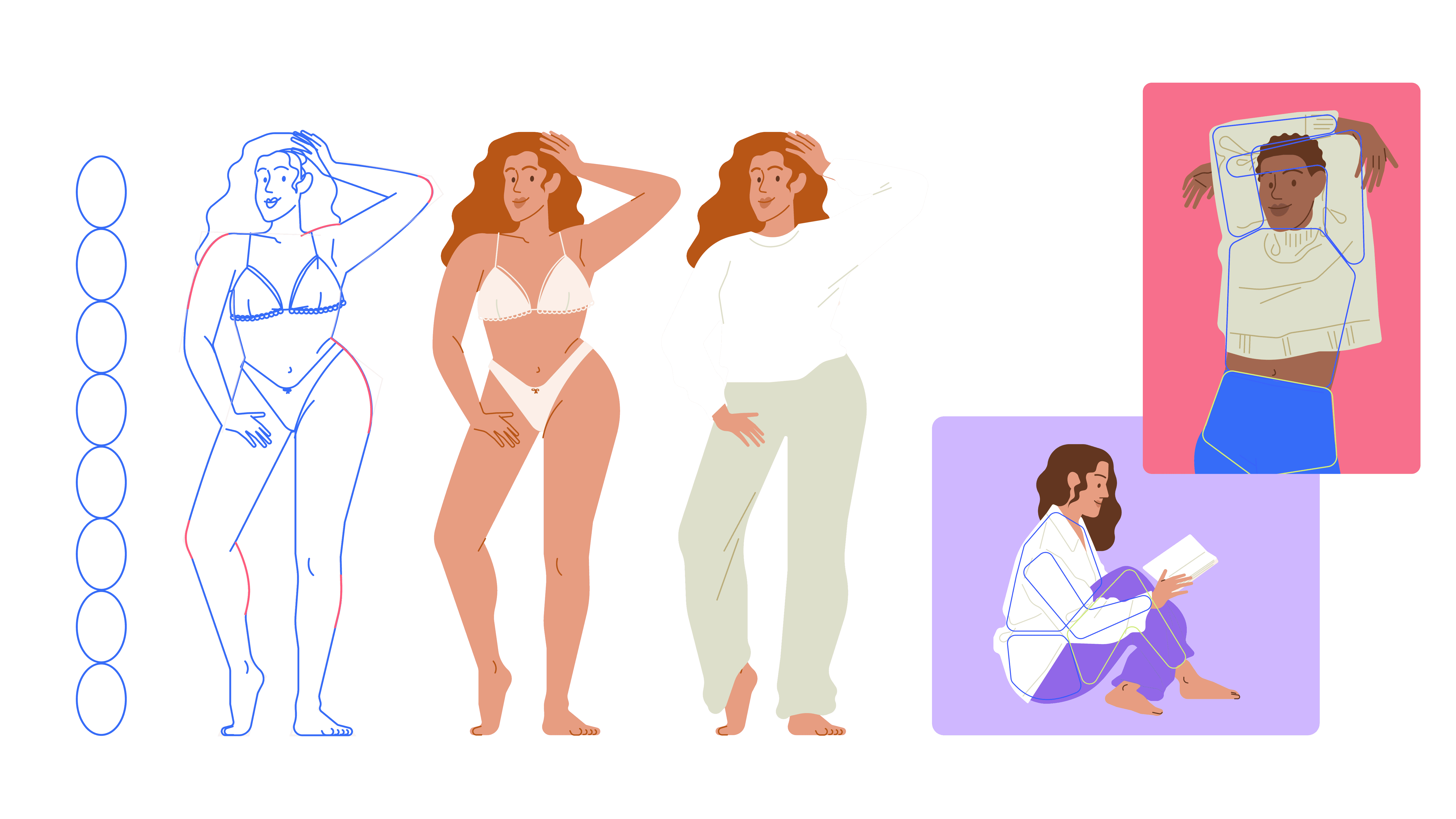
To ensure inclusivity, clarity, and emotional resonance, the character system was built on a flexible yet consistent foundation. Each face is constructed using one of three basic shapes—oval, square, or triangle—to reflect diversity in appearance while maintaining visual harmony.
Characters are designed to represent a broad range of ages and emotional states. This modular approach enables the illustration system to adapt fluidly to different user scenarios while remaining cohesive and brand-aligned.

Body
The character body was designed using a modular structure with consistent proportions, allowing flexibility across different poses, outfits, and contexts. The form balances stylization with natural anatomy, making characters feel both relatable and visually cohesive.
To support consistency across a team of 15+ designers, we implemented an automatic corner radius system for all shapes, ensuring uniform curves and scalable quality throughout the illustration workflow.
The result is a body system that’s clean, versatile, and optimized for both static and animated use without compromising the brand’s aesthetic integrity.

Color System
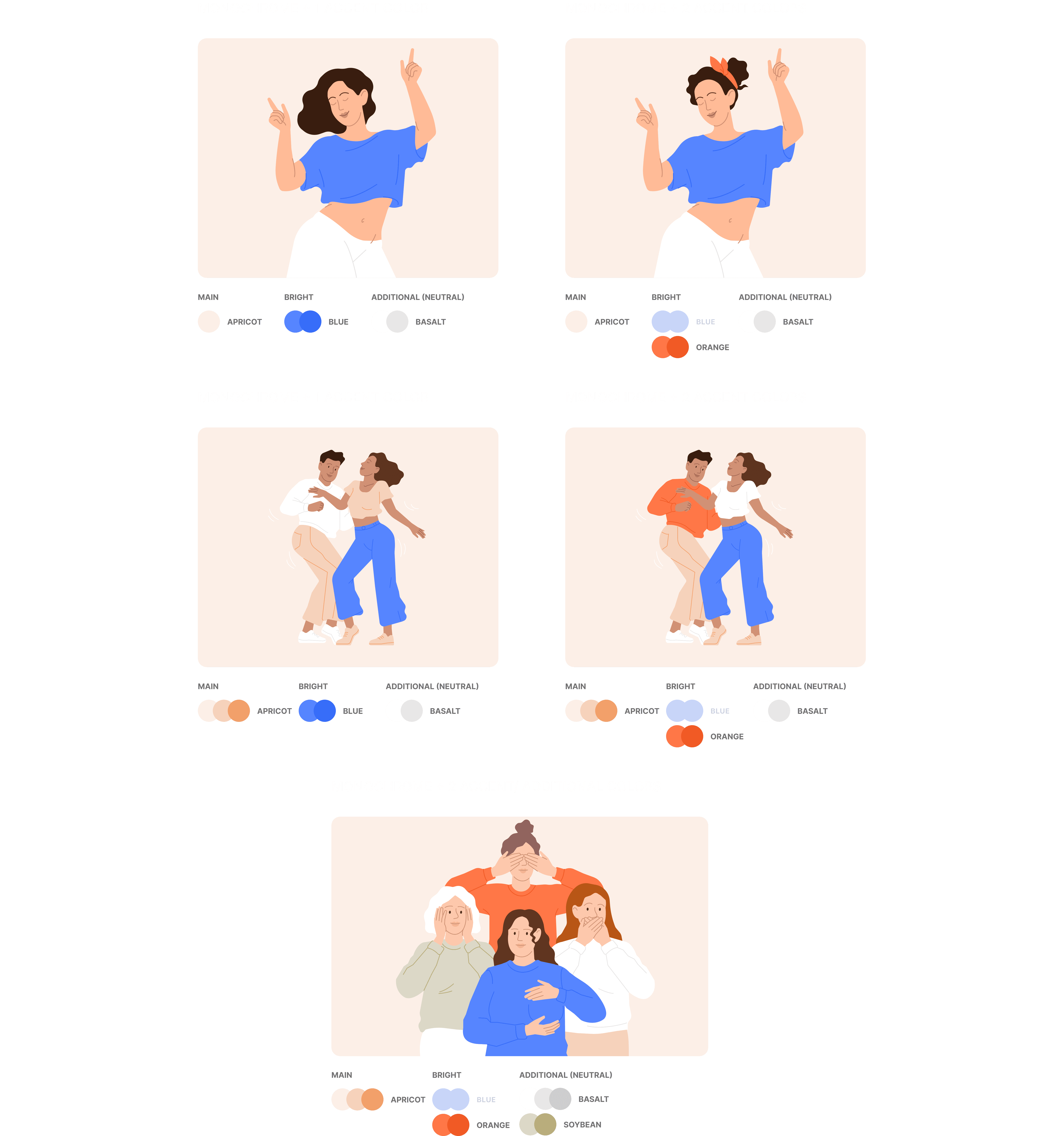
The holistic brand color system was developed as a separate initiative, but its close integration with illustration makes it essential to highlight here. A broad extended palette was broken down into smaller, modular subsets—each tailored to a specific audience segment within the app.
These curated palettes are applied in varying proportions to maintain visual consistency across apps modes (Track, Partner Mode, Pregnancy, Perimenopause) while supporting distinct user journeys. This approach allows the illustration system to remain cohesive, while subtly adapting to the needs and expectations of each unique user group.
Color Usage In Illustration
In illustrations, we aimed to follow a minimalist approach to colour usage. Primarily, use shades of the background colour + one or two bright (accent) colours, depending on the complexity of the composition.
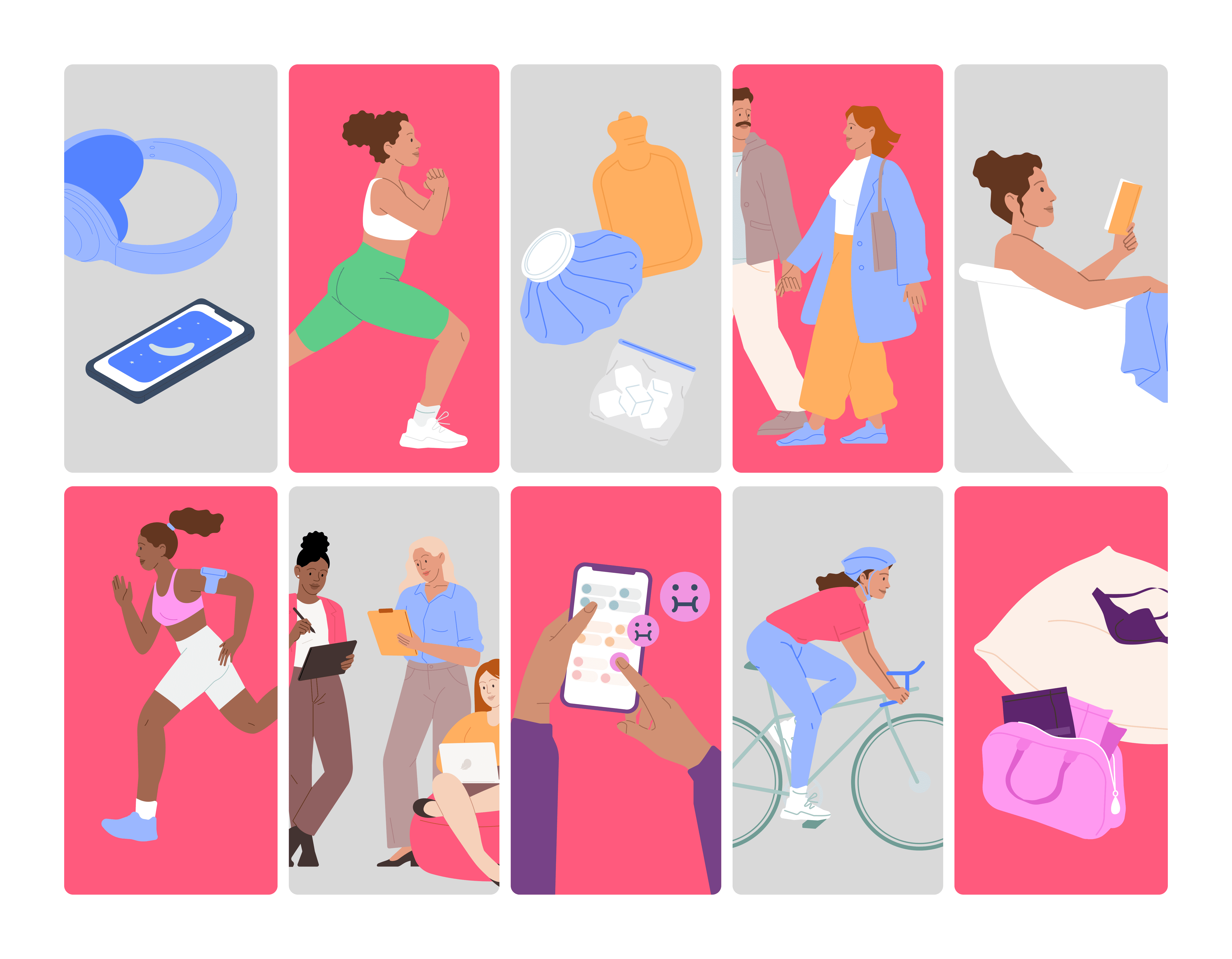
Lifestyle/ Symptoms/ Relationship
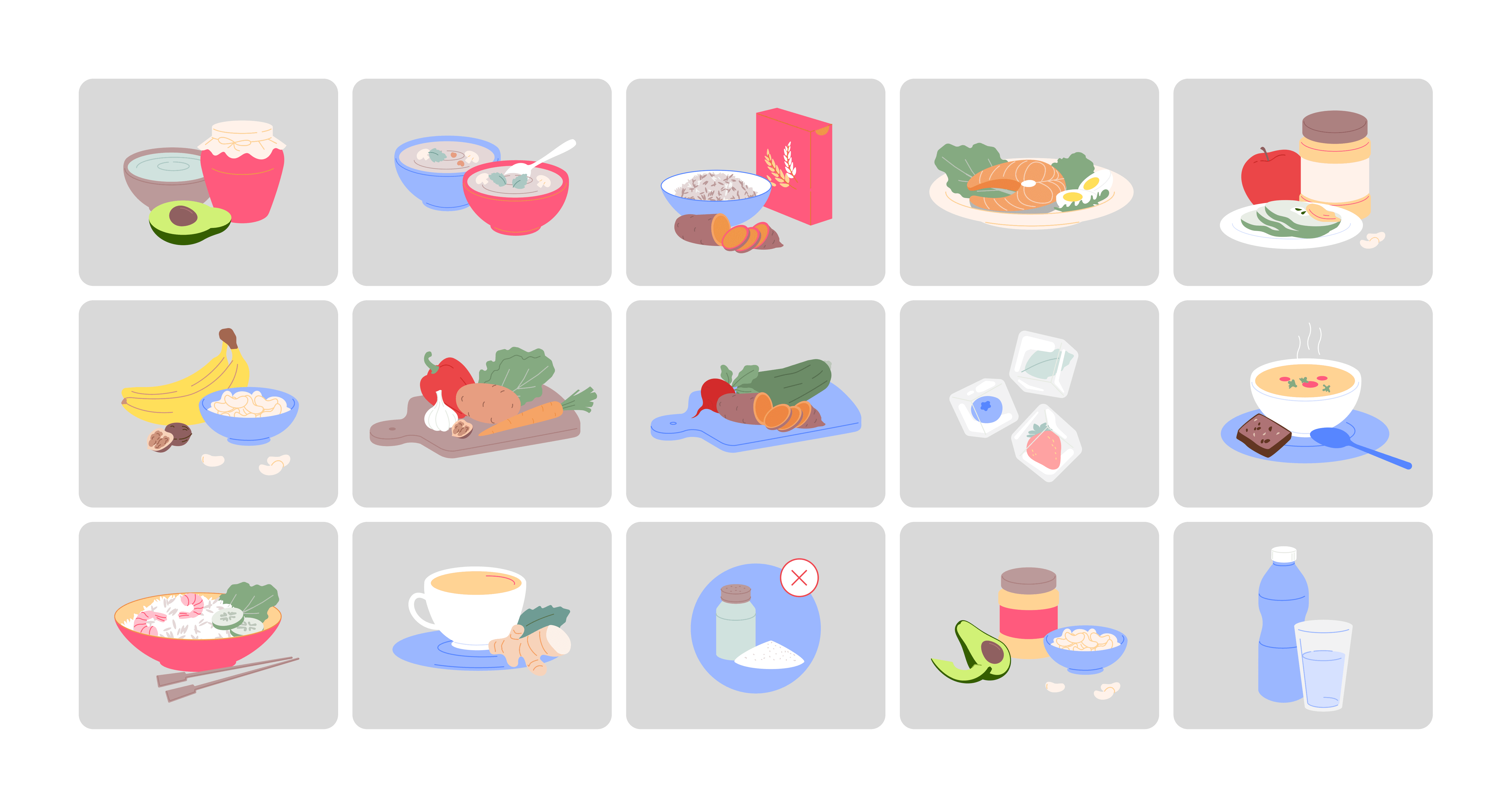
Food/ Objects
In App Usage
llustrations were integrated across key touchpoints in the Flo app to enrich the user experience and reinforce brand identity.
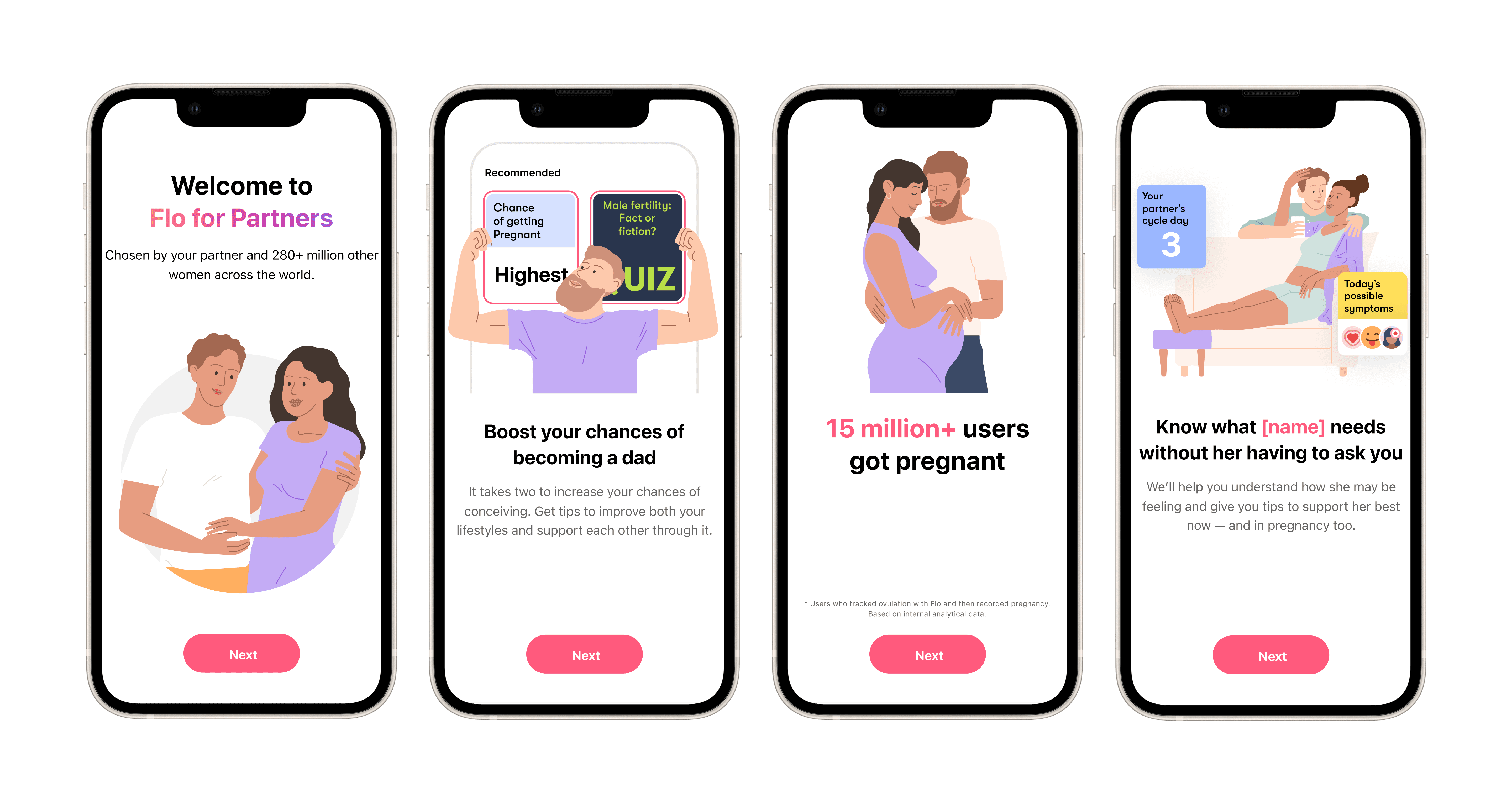
During onboarding, they help create an immediate emotional connection and clearly communicate the app’s purpose and benefits. Within the main app content, illustrations support storytelling, provide visual clarity for complex topics, and bring warmth and relatability to sensitive health subjects.
Around 80% of content is supported by illustration media, with only about 20% using photography—highlighting the central role of illustration in shaping the app’s visual communication. The system’s flexibility allows consistency across a wide range of features—from educational modules and user prompts to more intimate moments—ensuring a seamless, human-centered experience throughout.
Onboarding
Content


Description
Anatomical imagery plays a crucial role in reinforcing the scientific credibility of the Flo app and helping users better understand the physiological processes occurring in their bodies throughout their journey. It bridges the gap between complex medical concepts and accessible, user-friendly communication—supporting both trust and clarity within the product experience.
Goals
Redesign the anatomical content style to focus users’ attention on essential medical information, removing unnecessary visual noise to improve clarity and comprehension. Strengthen user trust through clear, accurate, and medically-aligned visual communication. Develop a centralized, medically-approved illustration library—accompanied by a comprehensive visual guide—to ensure consistent usage across teams and throughout the product ecosystem.
Visual Principles
1. Clarity Through Schematic Simplicity.
Illustrations are built on clean, minimal forms with a schematic drawing style. Detailing is intentional—every line, shape, and label must serve a functional purpose. The goal is to maintain medical accuracy while reducing cognitive load. Where possible, anatomical complexity is abstracted to preserve clarity without compromising correctness.
2. Functional Use of Gradients and Transparency.
Gradients and opacity are applied with precision, only when they improve the communication of spatial depth, layering, or internal structure. These elements are never decorative—they exist solely to enhance the viewer’s understanding of the anatomy. Their use is minimal, purposeful, and always grounded in visual clarity.
3. Subtle, Consistent Shadowing.
Shadows are used exclusively to illustrate internal cavities or spatial depth within anatomical structures. To ensure stylistic consistency, only soft inner or drop shadows are applied using predefined parameters. Ready-to-use shadow presets were included as Figma styles during the creation of the visual guide, enabling consistent application across teams.
Problems/ Solutions
Previously, the anatomical imagery lacked visual consistency and did not always meet the necessary standards of medical accuracy. During the redesign, I introduced several key improvements: a unified visual style, medically reviewed content, structured use of color and detail, and a scalable illustration system—ensuring both credibility and clarity across all user touchpoints.

Problem: Overloaded visual style created poor attention flow, making it difficult for users to focus on key information. Organ recognition required unnecessary effort due to visual noise.
Solution: Redesigned the visual approach by removing excessive strokes and shifting to clean, schematic shapes—improving clarity and guiding user attention more effectively.

Problem: A limited style using only lines and solid shapes failed to accurately convey anatomical complexity and depth.
Solution: Introduced controlled use of gradients and transparency to define spatial layers and enhance anatomical understanding without overwhelming the viewer.

Problem: Lack of detail and over-stylization led to anatomically incorrect or misleading visuals.
Solution: Adopted a more precise, medically aligned illustration style—balancing clarity with anatomical credibility to build trust and improve user comprehension.
Library
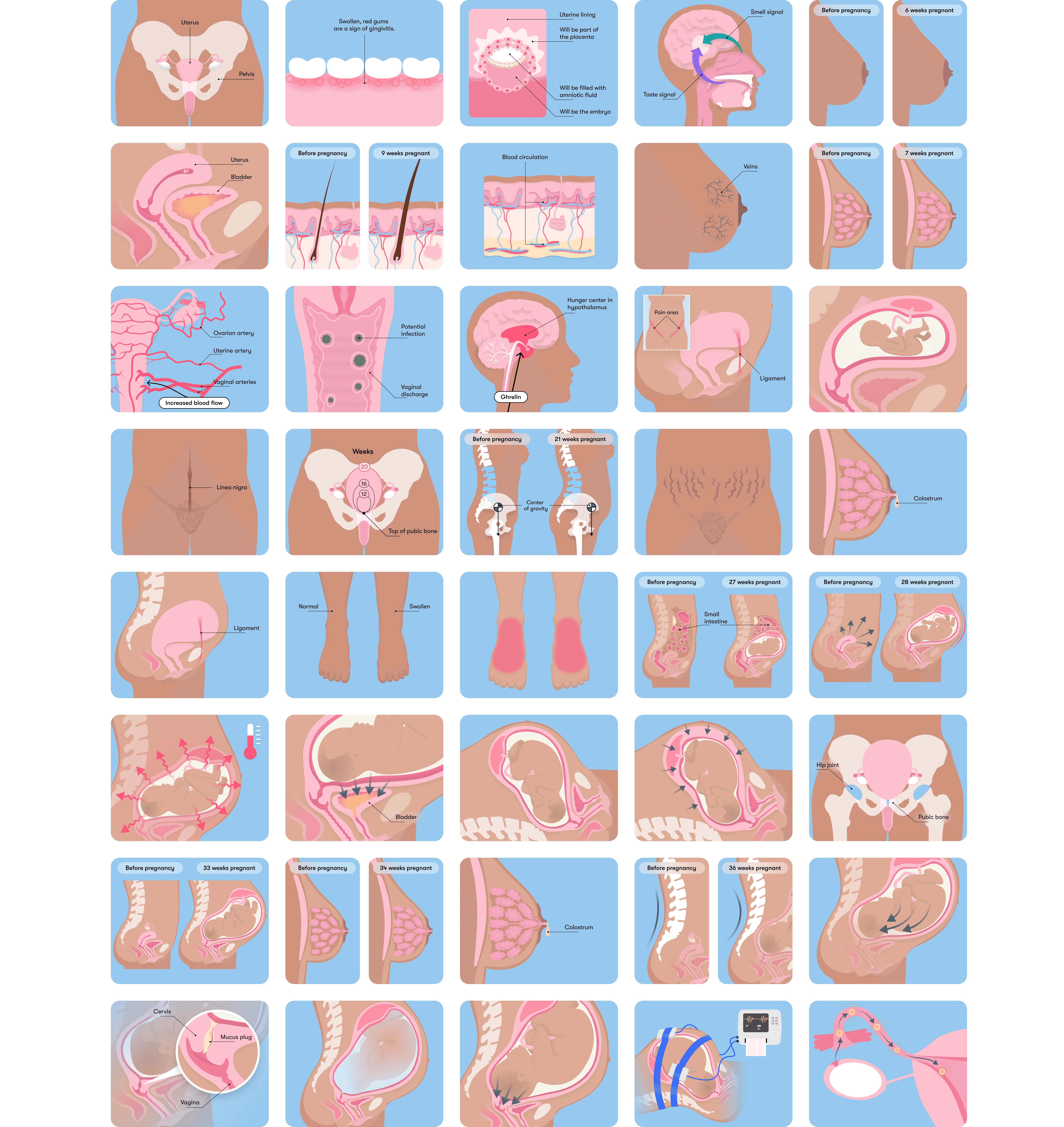
A centralized, medically-approved illustration library was created to support consistency, scalability, and cross-functional collaboration. It includes a wide range of high-precision anatomical visuals—covering reproductive anatomy, physiological changes, pregnancy stages, common conditions.
This library ensures quick access to accurate and style-aligned assets for designers, medical experts, and content teams. Each illustration follows the established visual guidelines and is optimized for in-app use, educational content, and health communication.
In App Usage
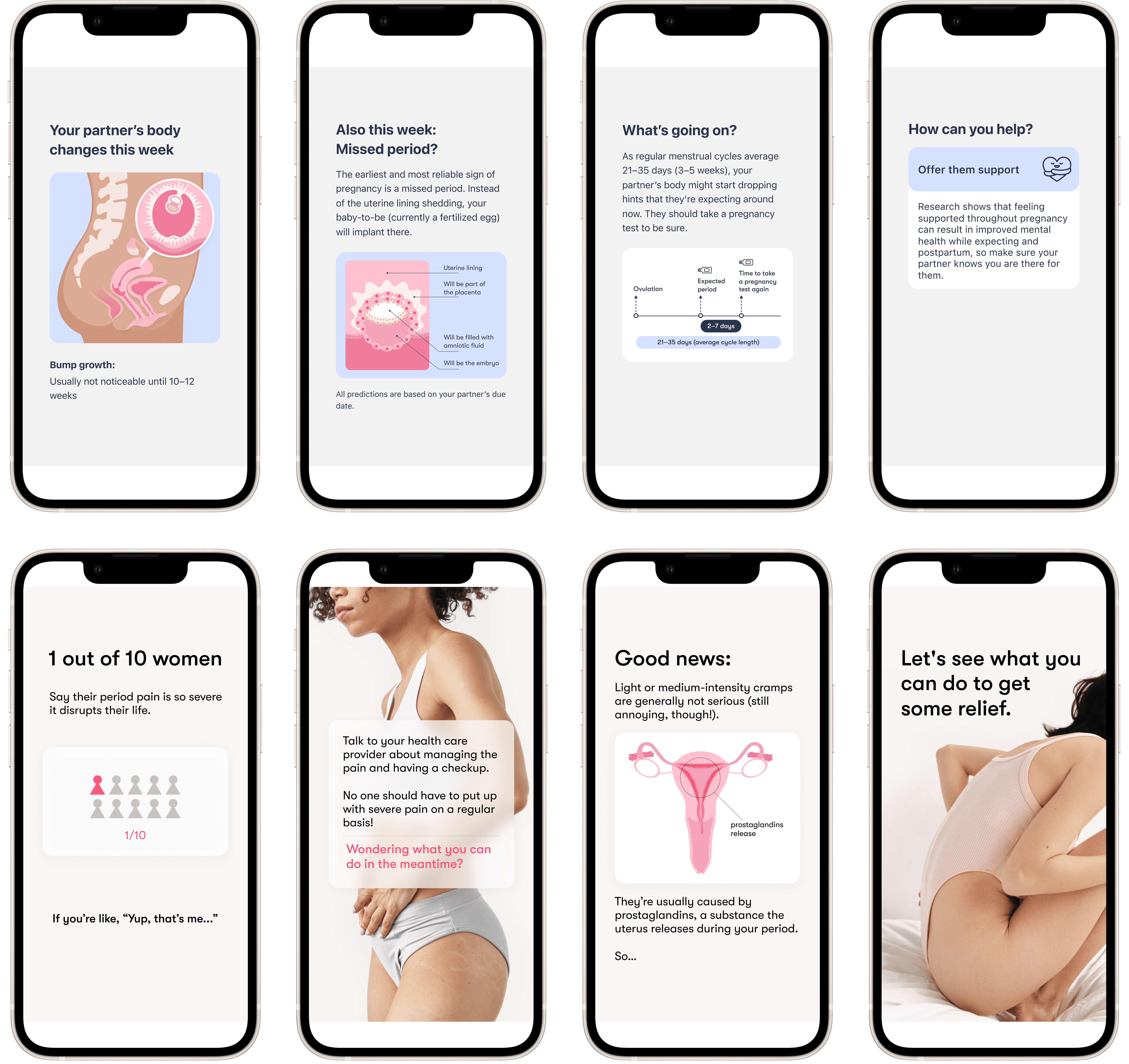
Anatomical and educational illustrations are seamlessly integrated into key app screens to enhance user understanding and engagement. Whether explaining early pregnancy changes, menstrual symptoms, or partner-related insights, visuals help transform complex medical information into accessible, supportive content.
This visual approach supports a wide range of user needs—from emotional reassurance to clinical accuracy—while maintaining consistency with Flo’s brand and illustration system. The blend of illustration, typography, and selective photography creates a human-centered experience rooted in empathy and trust.